Delivering data is part of many presentations—and how well you present numbers can have a big impact on the success of your projects, your ability to get what you need, and even the safety and well-being of hundreds of other people.
As for any presentation, you'd be wise to consider your goals and your audience:
Is your goal to evaluate and determine, for example, or is it to persuade?
Is your audience a group of data-loving engineers or are you speaking to executives with limited time and knowledge?
Your objective, audience, and an accurate interpretation of your findings should be the major influences in how you decide to use numbers. But there are a few guidelines you can apply in nearly every presentation to make your data more accessible for all audiences.

Avoid a data dump
We see a tendency among some types of presenters: If numbers tell the story, let's give them ALL the numbers.
While some audiences love details, dumping all the data on an audience can be counterproductive. As you consider your audience, ask yourself—what do they really need to know here? What data is less important? What can I leave out?
Often, it's much more effective to present a few key numbers well. Of course, this requires you to make some assessments about what's critical and what isn't.
Sometimes that's easy to do and sometimes it's hard. You'll have to use your judgment but the important thing is to use it. Don't default to dumping all the numbers on an audience without considering what they need.
"There are two goals when presenting data: convey your story and establish credibility."
– Data visualization expert Edward Tufte
Provide context
We once watched a person exclaim, "We lost one million dollars because of this error!" He expected his audience to be incensed. Instead, they yawned. Why?
Because the team he was presenting to built nuclear reactors and expensive errors were common. It was only after he presented context—"Our most expensive mistake prior had been $100,000"—that the audience appreciated the problem. This mistake was ten times more costly than any other in his division's history.
When you're presenting numbers, remember that the audience may not be operating with the same information you have. Help them understand by putting the number in context. For example, where does it fit in a trend you see? How does it compare to numbers in other areas of the business? What does that percentage really mean?

Make the number accessible
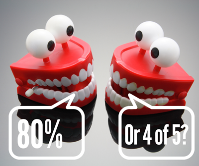
Four out of five dentists. A car crash every minute. Enough plastic bottles to fill the Super Dome. You've seen advertisers and advocates do it. They find ways to make large, abstract numbers concrete and imaginable for their audiences.
This can promote understanding, of course. It's especially good at motivating action. We saw a company struggle to connect with leaders over an important statistic: 80 percent of customers were leaving because of shipping mistakes. Seems huge, yes? But the team couldn't motivate a change until they presented the number in a more persuasive, visual way: 4 out of 5 customers are leaving us because of our shipping mistakes.
Executives could see five customers, and they could see four of them leaving. The leaders in the room authorized the changes to shipping processes before the presentation was completed.
Weigh when to round up
Speakers are typically encouraged to round numbers when presenting—not 742 acres of pristine forest have been preserved, for example, but nearly 750 acres. It's easier for audiences to absorb.
We suggest, though, that you think about your goal and the best way to communicate the number. Are you looking for a solution that requires precision? Then the precise number is important.
If persuasion is your goal, consider the audience and how the number works. For example, if you're pitching a staffing increase, you might present the cost down to the penny—to demonstrate you've crunched the numbers. If you're talking to a potential client and your company was ranked number 47 in a national survey on customer satisfaction, you might consider saying you're one of the top 50 companies in the nation—if you think that sounds more impressive than being ranked at 47.
Choose to round the number or not, considering how best to express it to achieve the impact you hope it will make.

As you can see, the key is to consider why you're presenting the data, who your audience is, and what you need to achieve. Data can be powerful information if audiences can understand it, apply it—and if they can trust that the presenter has delivered the numbers accurately and in good faith.


