"What’s the one thing?"
In our Executive Seminars, we work on creating strong opens to presentations. And we wind up asking this question of most speakers:
What's the one thing you want them to take away?
Sometimes it's buried deep in the presentation. Sometimes the speaker isn't sure.
Some speakers insist there isn't just one thing--and we can relate. Many topics are complex and seem to defy being summed up in a single statement. Yet, we also know that audiences take in information best if they understand the point, where you're going.
So what's the one thing? The one idea, feeling, or piece of information you want them to remember above all else? Because that can give your message a shape and help the audience follow you.
 It IS rocket science: NASA poster presentations
Poster Presentations and the Main Idea
A recent NPR story about poster presentations provides one of the best demonstrations we've seen of how powerful this can be.
Poster presentations are a staple of communication within the science and medical fields. We first encountered them face-to-face through our work with a nursing leadership program.
If you're thinking it sounds like a carryover from school science fair days, you’re not entirely wrong. As one nurse was telling us, you might think of it as a trade show floor—only instead of booths you have a roomful of posters, and the people are pitching their discoveries and research instead of products and services.
These posters, for the most part, are an information dump. Everything is squeezed onto the poster that can possibly be put on there. Even when a design template is used, most posters suffer from information overload.
Which, in turn, leads audiences to tune out:
"Whatever you care about — whether it is exploring the universe sooner or curing a disease that your friend has — is happening slower right now than it should, because we have all these inefficient systems for disseminating knowledge among scientists."
That's what psychology doctoral student Mike Morrison told NPR about the problem with poster presentations in the sciences. But he’s done more than complain. He’s provided an alternative design, one that solves the presentation problem of spelling out "the one thing."
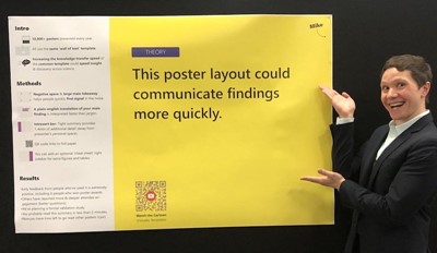 Mike Morrison, the clear thinker behind a design movement to change scientific poster presentations. (Photo by Mike Morrison/from NPR)
Obstacles to a Clearer Message
As Morrison explains through an animated video he made, posters—like many presentations—often bury the main idea. How can such super-smart people make this mistake?
Often they:
- Assume the title of their presentation is the same thing as the main idea—when it’s not.
- Believe they have to lead you through their thought process BEFORE they can provide the primary takeaway.
- Think that all audiences will see, instantly, the value of details and data just as they do.
In the video, Morrison asks scientists to take a walk with him around an imaginary room filled with posters. How, he asks, can the audience determine which ideas interest them when they can’t distill what the main ideas are?
Then he uses a colleague's poster to demonstrate how to perform your own message makeover.
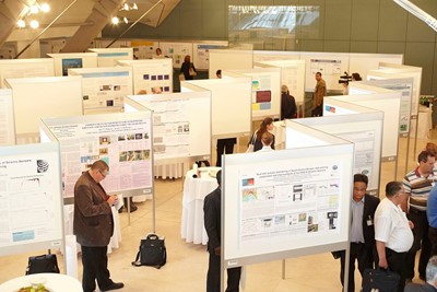 A room full of posters: Poster presentations at a conference. (Copyright CTBTO Preparatory Commission; photograph by Marianne Weiss)
Techniques that Work for Every Type of Presentation
What we like most about Morrison's approach is that there are lessons here that apply to all types of speeches and presentations:
1. Put the main idea out front—so the audience knows the topic and why it matters to them. In a business presentation, if you are reluctant to lead with the main idea consider this: Audiences know what to do with details if they have an idea of where you're going.
Sure, there will be times when you have to build to your conclusion (ex: We need to increase head count), but at least give them an idea of where you’re headed before you set out on the winding trail (ex: With so many new clients on board, we’re asking ourselves how to meet new demands).
2. Understand the difference between what you should present visually and what should be designated as notes just for you. Morrison creates an out-of-the-way column for supporting information.
In a business presentation, you might use the notes section on PowerPoint or put notes on good old-fashioned paper. The big idea here is that you should not project your notes front and center for the audience and clutter up your message.
3. Use the best medium to deliver information—instead of shoe-horning it into a format that doesn’t serve the audience. Morrison includes a scan code on his posters so that you can download the full scientific paper, but you don’t have to be that high tech.
Providing a printed spreadsheet instead of projecting it in your PowerPoint is another example of putting information into the right format to make it easier to digest.
4. Be bold! When you information dump, in a way you’re shifting the burden of critical thinking onto the shoulders of others.
In the business world, bosses often want to know what’s important here or what’s your take. Sifting out the main message takes some confidence, but it's also a better use of their time and your expertise.
Learn More
Here’s a link to the NPR story about Morrison and the quest for better poster presentations. (Naturally, one of the scientists using his design is also tracking eye movement to determine how effective it is.)
Below, you'll find the video Morrison produced to explain the problem and demonstrate how his approach works. For the non-science viewer, the set-up may feel a tad long; if you want to jump to the excellent demonstration of how to redesign (mentioned above), zip ahead to the 10:45 mark and watch him get to "the one thing":