
We’ve been helping a group this week with some lengthy PowerPoint presentations. It has us thinking about a problem most everyone can identify but many presenters struggle to avoid: the too-busy slide.
If you already have a few of those in your deck, no worries. You can make some easy changes that will improve your slides and help you keep your audience engaged and on track.
We're not going for design perfection here...but for maximum gain with minimum effort. Try these quick fixes:
1. Delete words
Go from complete sentences to key words. Don’t put everything you intend to say on the slide. Not only will you make the slide less distracting for the audience, you leave yourself something to present. After all, if they can read it on their own, they don’t need you!
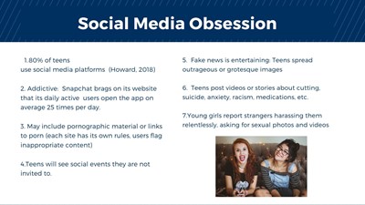
Before:

After:

2. Make photos large
Are you already using a photo on the page? Don't relegate it to the corner like a postage stamp. Let a strong image fill the screen. And if you delete words (see above) and limit yourself to one idea per slide, you'll have room for the main message.
Before:
After:

3. Let the graphic stand alone
Take off the legend and the words. Since you’re standing there, you can explain what the colors and symbols mean. It's another way to keep the audience engaged with you, make your presence essential, and eliminate distractions.
For this example, we didn't have the original graphic so our image is fuzzy when we enlarge it. Best to avoid that. Still, we like it better than the busy version.
Before:

After:

We know many organizations have a PowerPoint template that they instruct everyone to use. But we also hope for some common sense: Don't let the template force you into making slides that don't work for your audience.
And if you want to learn more about strong slide design, we're big fans of this book.