40 accountants
40 ginormous PowerPoint decks
Each slide crammed with information
And every accountant in the firm was counting on The Buckley School’s one-day workshop to help them improve their client presentations.
When school co-director Jenny Maxwell started seeing these presentations roll in, she says it occurred to her: “Given the average life span, I may not have enough years left to fix these.”
So she took one slide from each deck and challenged herself to improve that slide in 30 seconds.
3 Ways to Improve PowerPoint in 30 Seconds
Here are three of many techniques Jenny uses to simplify PowerPoint slides that came out of that experience.
1. Click "save as" and delete words
"Often when I work with companies, people there tell me that PowerPoint has to work as a leave-behind as well as a presentation," says Jenny. "My accountants explained that’s why they were putting so much detail into each slide. So the slide can speak on its own."
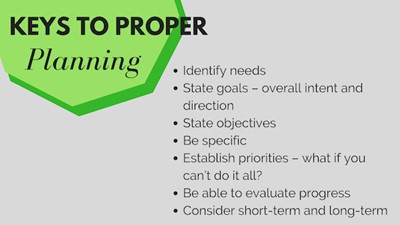
 Before: "This is someone using their PowerPoint slide as notes," says Jenny. "Surely you don't need to put 'be specific' on the slide. Just say it and delete those words."
The problem with that, of course, is that if people can read everything on the slide, then your PowerPoint deck is upstaging you in the presentation—and distracting your audience.
Jenny suggests taking the detailed deck, clicking "save as," and creating a less wordy version for your presentation. "That way, you still have your PowerPoint-as-handout, but you can create a version that won’t compete with you when you deliver."
Then for the presentation version, she says delete all but key words. Get rid of complete sentences.
"I’m not opposed to a few words on a slide—and when the topic is technical or you’re working with global audiences who speak English as a second language, key words can be a huge help," she says.
"But using complete sentences, putting paragraphs on the screen—that’s too much. And deleting is such a quick fix."
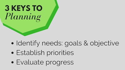
 Jenny: "Easy enough to delete the words you can say. I went with the old 'rule of 3' to organize the info and made a simpler slide in 30 seconds."
2. Improve the headline
"Often, people use the header space on a PowerPoint slide as if it’s the tab on a file folder," says Jenny.
"So, for example, instead of a header that says 'About Us' why not actually say something about your company? Or over a graph, instead of stating the obvious—Comparative Analysis—why not put the point you want people to take away?"
Jenny says this not only makes the slide stronger but also helps you do a better job delivering it.
"The tendency is to use the header as the opening statement when we advance to a slide. If the header becomes what most speakers think of as ‘the takeaway,’ then you’re that much more likely to launch with your main idea when you explain the slide."
 Before: The headline space was underused and the graph and type were too small.
3. One image or idea per slide
The press to reduce Death by PowerPoint in companies has led to another problem: Jam-packed PowerPoint slides.
"I hear people say they’ve been asked to limit presentations to 10 slides or fewer. So they shove four slides worth of information and images onto a single slide. That doesn’t help anyone," says Jenny.
Instead, she recommends you have more slides with less information on each one--and make each chart or diagram big enough that people can see them.
"For example, I often see something called a four-blocker. It has four graphs or charts on a single slide. Break that up into four slides, with one graph or image on each slide—and instantly you have a better way to present that information."
 Jenny: "Why not tell them the main takeaway in the header space? Also, on this one, resize the graph and make the type bigger so people can see it without squinting."
And if the company standard is to present that information in handout form as a four-blocker, Jenny says you can forward your original slide to the boss—because you still have it.
"That’s why I says click 'save as.' Then you can have the best of both worlds—the handouts you need, and the presentation deck that won’t upstage you."
More PowerPoint and Presentation Tips
For ideas on how to design better PowerPoint slides from the get-go, you might like this book.
And of course, you don't have to default to using PowerPoint. You might consider limiting it or even presenting without it--and concentrate on building audience rapport.


